An education in visual identity
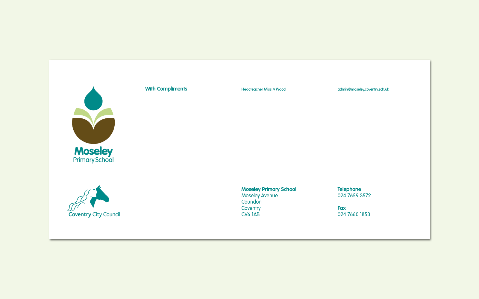
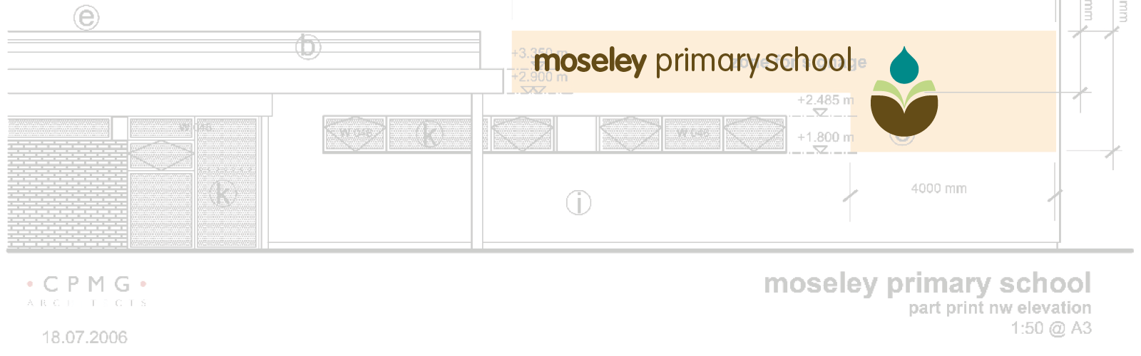
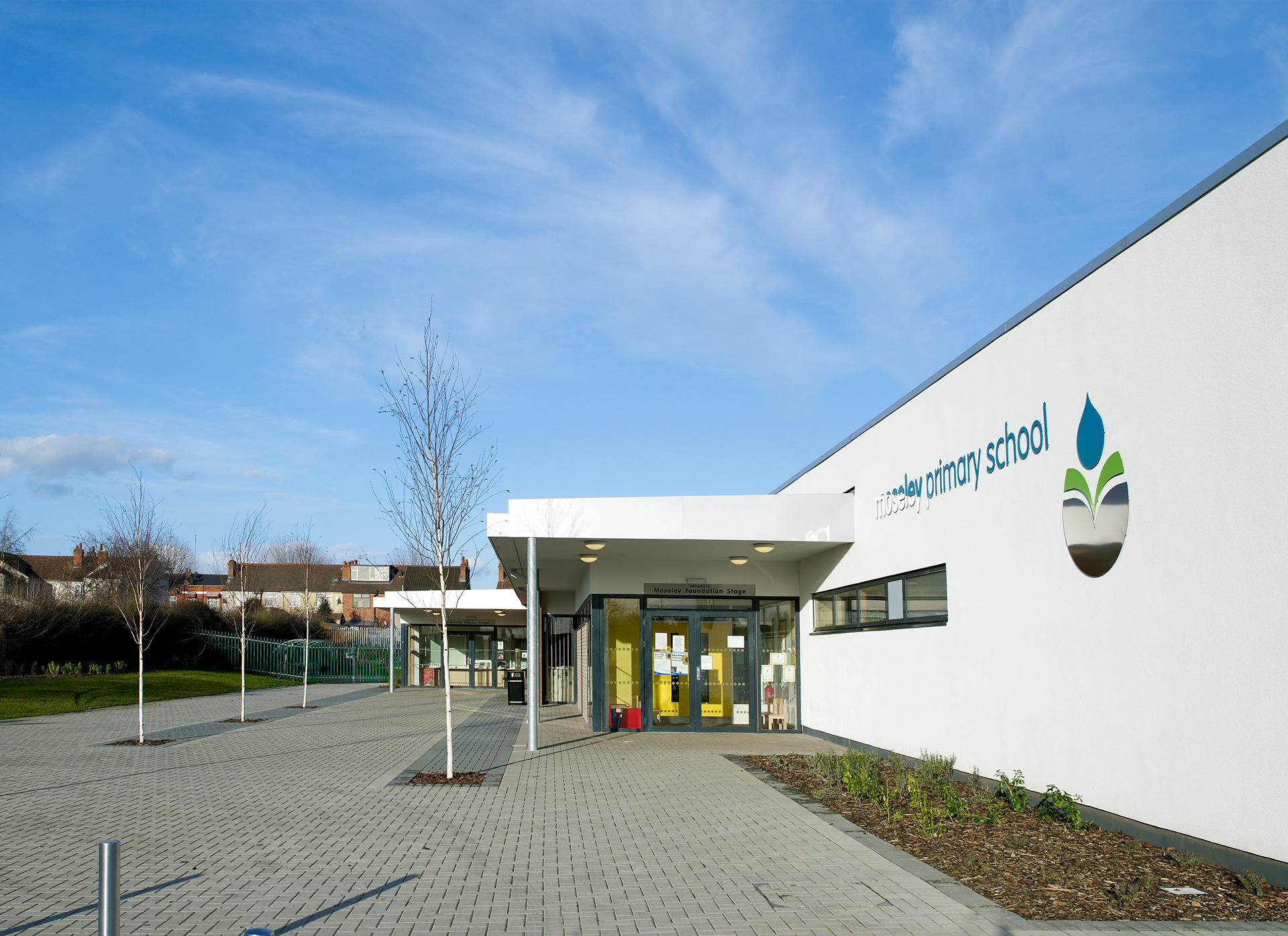
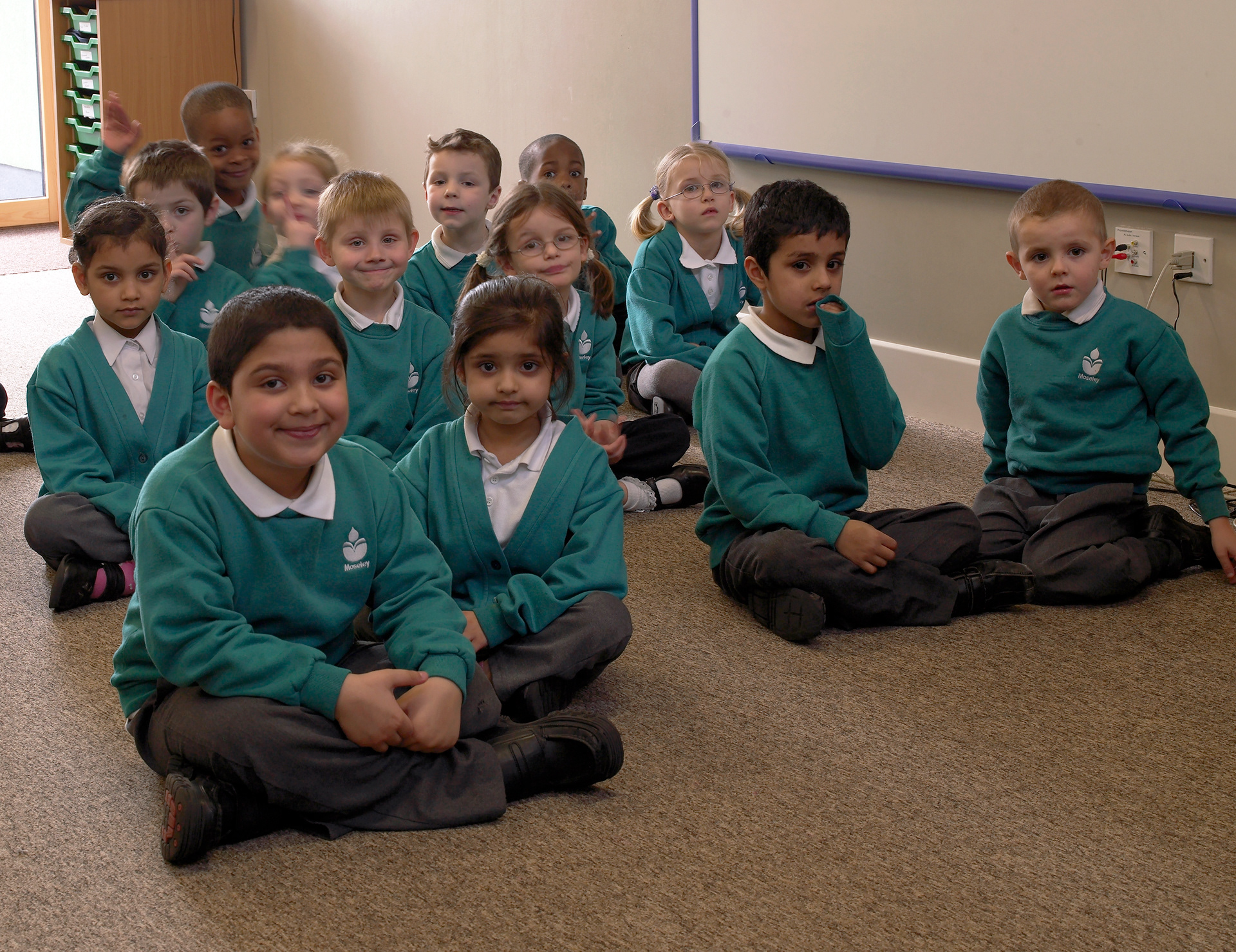
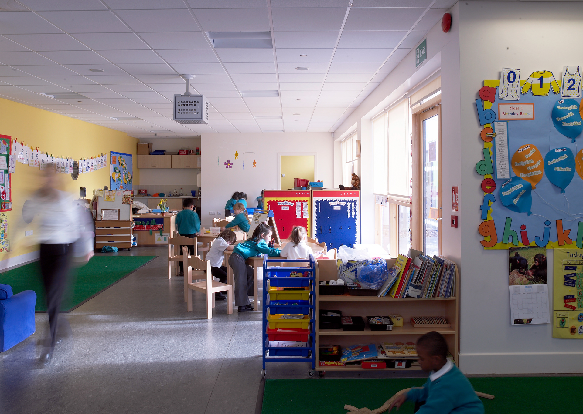
I felt privileged to be able to develop a visual identity for the newly rebuilt and eco-friendly Moseley Primary School working alongside the architects, CPMG.
I took inspiration from the building work and the motivations of pupils, teaching staff and school governors. The design reflects a vision that is modern, future facing and environmentally responsible. It communicates clearly to both adults and pupils, creating a sense of pride in a school that belongs to the local community.
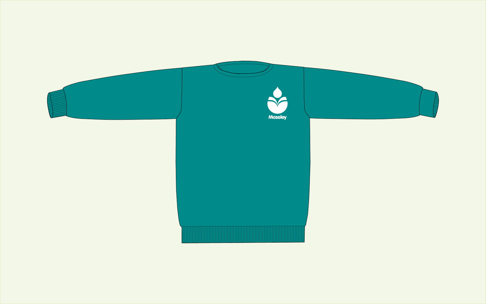
The final design route achieved the above by compressing multiple layers of representation, each reflecting the specific elements of the design problem. First it focused on growth and germination as metaphors for the learning process. Second, the visual identity reflected the functional elements of the new eco-build, such as the recycled rainwater and a sedum roof. Third, the identity used a non-gendered and ethnicity-neutral pictogram signifying an individual reading a book. I derived the colour palette from organic matter and the typography is simultaneously modern and legible; yet friendly and inclusive.
"Thanks for everything. The kids really love the identity and they’re proud of it. I know that’s true because parents have told me.”
Arlene Wood, Headteacher