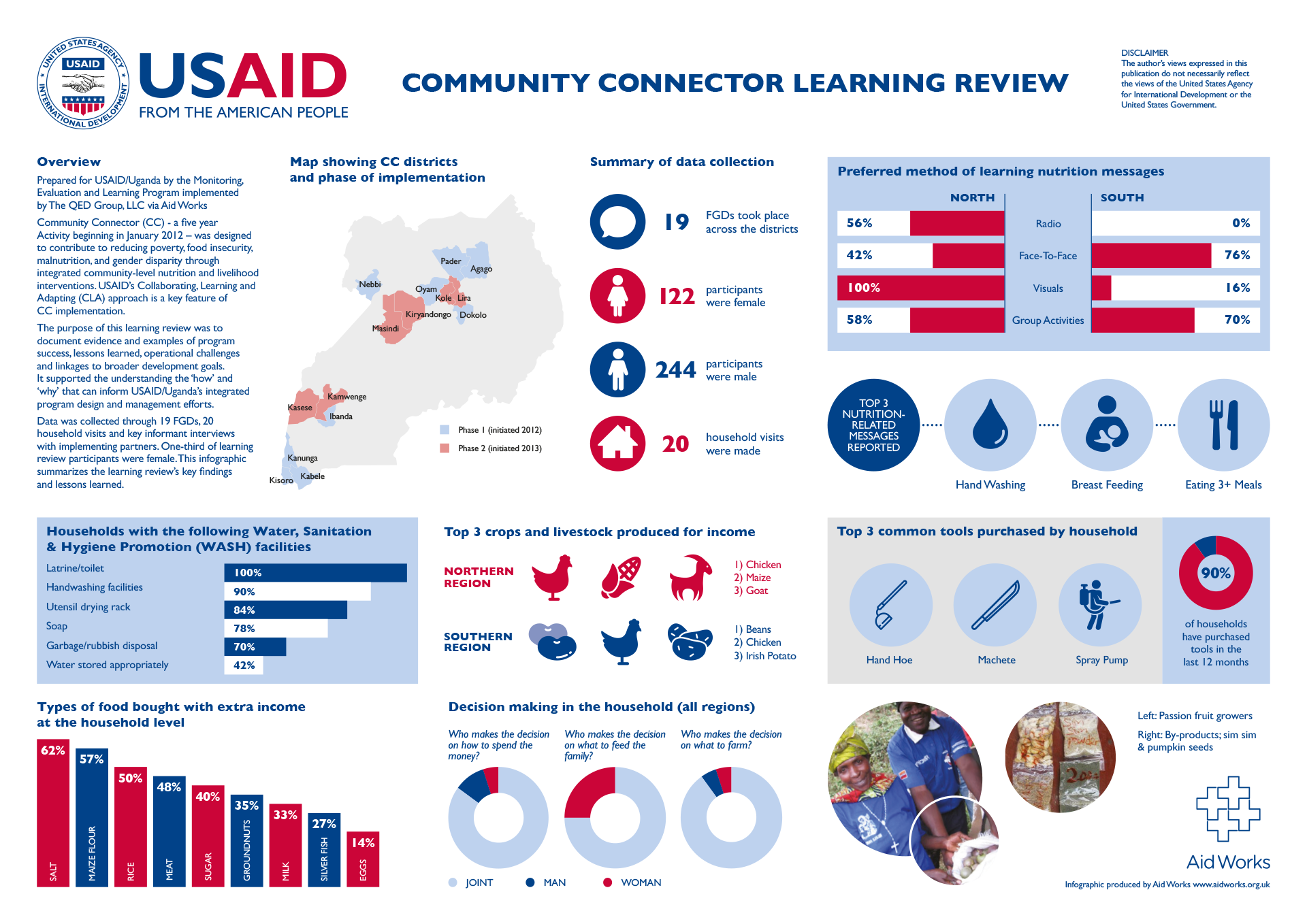
A visualisation of data collected from a USAID community connector project in Uganda
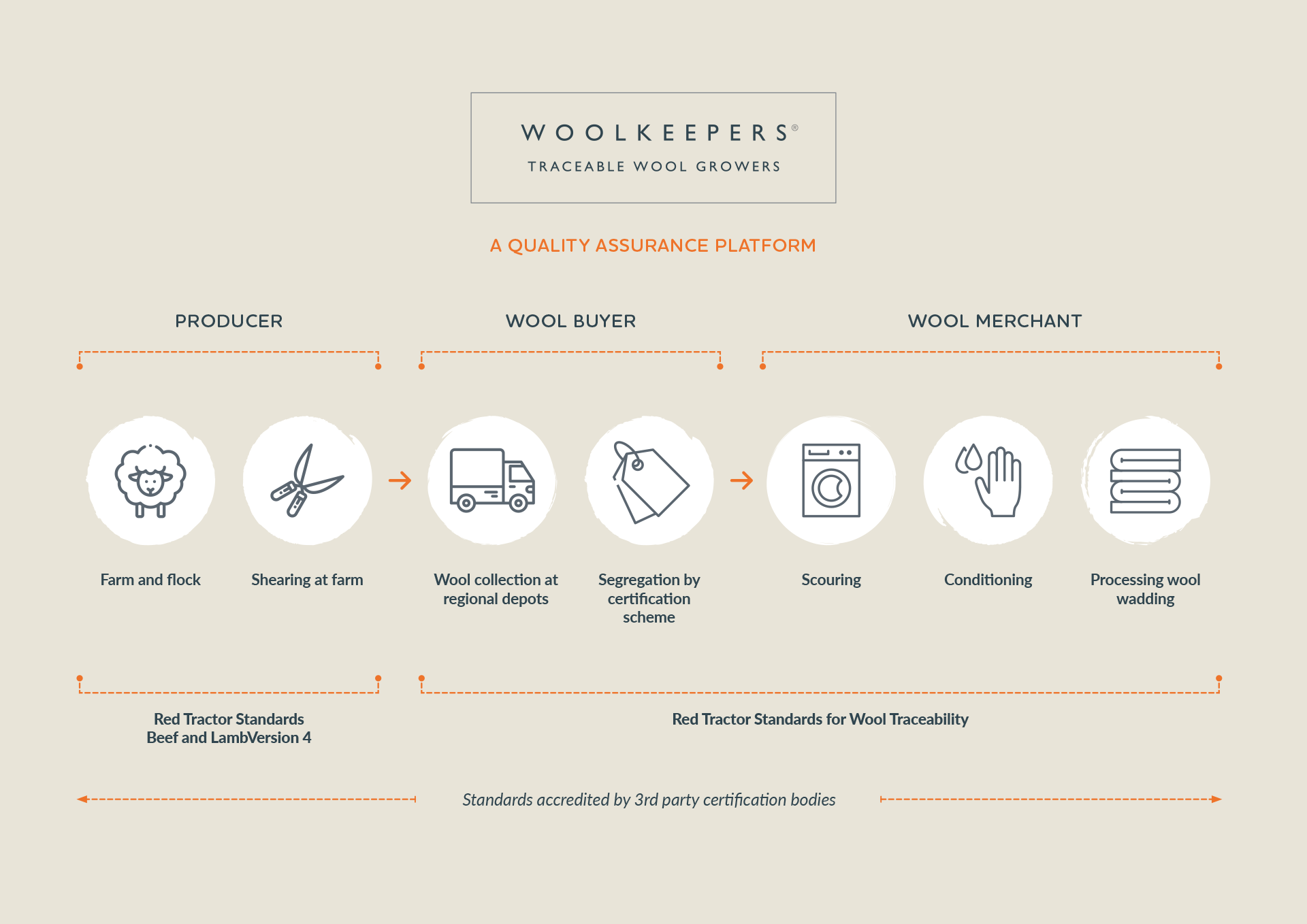
Infographic illustrating a traceable, quality‑assured wool journey from farm to processing
Turning data into visual impact
I love turning complex data into clear, visually engaging infographics. Whether working with insights from the aid sector or agricultural projects, I focus on storytelling, clarity, and strong visual structure. Designing infographics lets me blend creativity with problem‑solving—resulting in work that’s not just eye‑catching, but genuinely useful.